Up For Growth Coalition Logo

Category
Graphic Design, LogoAbout This Project
Designer: Tina Hong-Sandmel
Primary:
Legislators and potential coalition members
Secondary:
General public and potential community advocates, including advocates from the social justice, environmental and transit communities.
The logo and supporting content, images and graphics should communicate the benefits of how the coalition’s proposed permitting laws recommendations align with shared values of legislators and community groups such as: environmental sustainability, increased development around transit hubs (to promote transit usage), transit-oriented development, increased housing availability, particularly in urban centers, and housing affordability.
Concept 1
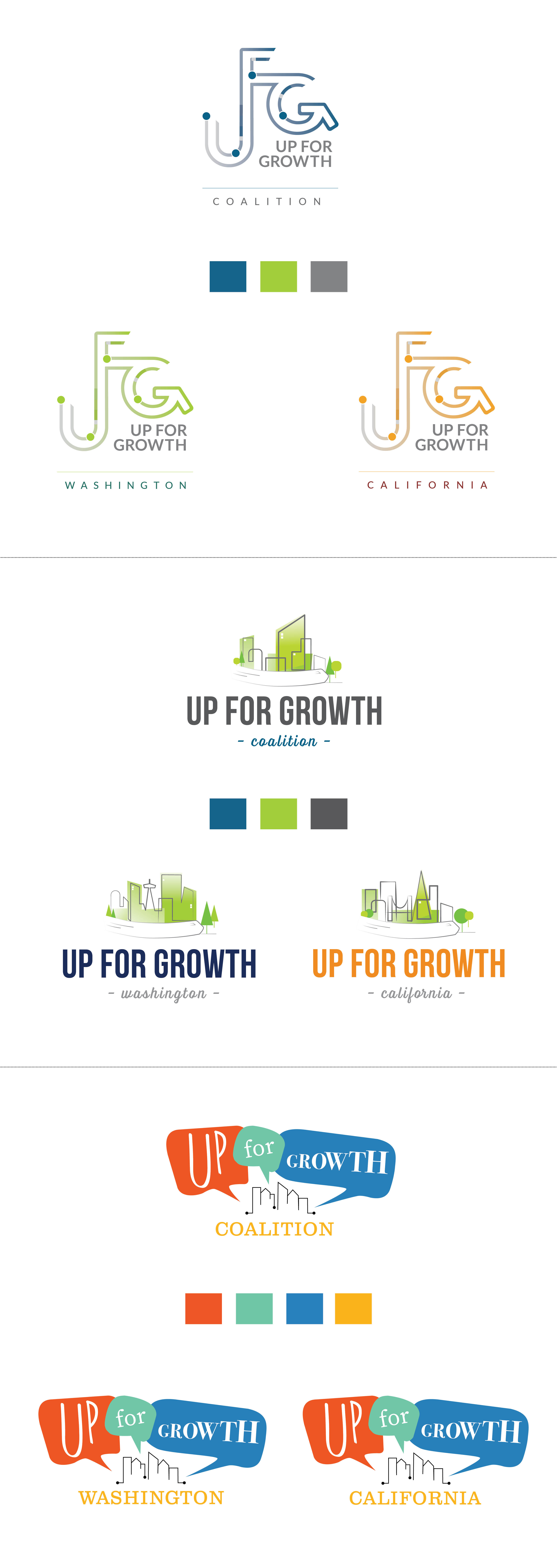
This option explores creating a UFG wordmark reminiscent of transit maps. The symbol suggests the idea of connected communities and the associated benefits. Variation in the color gradient suggest light-rail or metro connection and provide the logo with a sense of motion, energy and momentum. The graphic treatment of the G ends with an arrow pointing in a positive upward direction. Use of color differentiates between the national and state specific variants of the mark.
Traits emphasized: connected and communities
Concept 2
This option is an illustrative exploration showing thriving communities built around an urban hub. The city skyline allows for the state variants to incorporate familiar landmarks grounding the symbol in the state and providing for visual differentiation between the variants. The trees and transit hint at the positive environmental impact that the coalition and elected officials have interest in promoting. Lastly, there is a stronger emphasis on the name providing for more immediate recognition of a newlyformed effort name.
Traits emphasized: Welcoming, environmentally
conscious, communities
Concept 3
This option incorporates a more whimsical look with the suggestion of individuals, families and businesses coming together for with a common message of being up for growth. The use of speech bubbles provides a more personalized feel and emphasizes the coming together of the community and community benefits represented by the coalition. Bright colors and varying type faces continue the theme representing the many voices of the community and coalition. This option relies on color and type to differentiate between the national and state specific variants.
Traits emphasized: Friendly, kind, welcoming, communities

